July means many things. There’s heat, thunderstorms, fireworks, and kids having a chance to just be kids. If you’re interested in economics, however, July means that the second half of the year and the third quarter are starting – time for some new stats to start rolling out! If that doesn’t sound like a good time to you, just wait – you haven’t seen the lack of fun in the stats themselves.
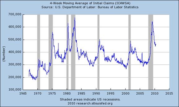
The problem everyone is starting to focus on is job creation. We simply are not creating jobs at anywhere near the rate necessary to absorb either the unemployment or the young people who are entering our workforce in record numbers. While “initial claims” for unemployment, or people asking for the bennies for the first time, are down they are still stubbornly at about the level you would expect in a regular recession. This chart is from the St Louis Federal Reserve:
I wanted to present this first because it gives the “falling unemployment claims” that are commonly written up in the press a little bit of perspective. Overall, the chart looks a lot like 1980 when it comes to claims for jobless benefits. As the year progresses the simplest thing to watch if you are looking for signs of a recovery is for initial claims to drop below 450k per week, where it has been for all of 2010.
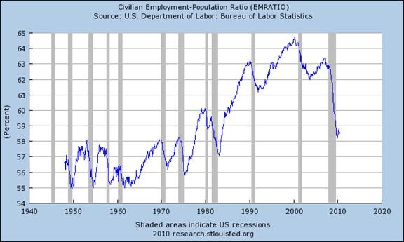
But initial claims aren’t the only place that needs a little extra perspective away from the cheerleading in the nooze. To understand how this Depression hurts overall household income another chart from the St Louis Fed is pretty handy:
This shows the total percent of the population with a job of some kind (and I apologize that the y-axis doesn’t start at zero). The percent of the population working went from 62.8% (or a peak of 64.5% in 1998) to 58.5%. We haven’t had this small a percent of our population working since we started to crawl out of the recession of the 1980s. More to the point, the last two decades has gotten us used to a lot more people in the workforce just to maintain our expected standard of living.
Clearly, something has to give. Either we create more jobs quickly or our standard of living has to drop. A falling standard of living means a lot fewer service jobs as people continue to economize, which means even less money in the economy.
While the St Louis Fed has a lot more interesting stuff for those of us who love stats and charts, I’ll leave it with these two. Together they have something to make sense of a commonly reported number and some perspective on why job loss has been such a big problem.
A bunch of numbers may not be your idea of summer fun, but these numbers probably aren’t anyone’s idea of fun no matter what. All we can do is hope for better the next time we check in.


It’s a lot more dismal than anyone wants to admit. At the start of this year we had a lot of people telling us the worst was over, and I think I can see that in the charts you show. But that does not mean it gets much better any time soon. There are a lot of people out of work.
You should say more about cutbacks in services and so on. I heard that no one is taking vacations away from home anymore, for example, causing the hotel industry to collapse. We haven’t felt that job loss yet.
I think the real cuts are still coming because service providers of all kinds have been holding on & trying to get through this. I think a lot won’t and thats when it all really hits the fan for jobs. Just my own crystal ball here.
Thanks, everyone. Jim, you have an excellent point. I’ll see if I can dig out some more things highlighting the service sector.
Here in the UK the pain will be really felt the first quarter of 2011 when the emergency budget cuts and taxes will come into full effect, Public Sector cuts will begin. Being a mere mortal I cannot understand where the notion of the Private Sector creating and stimulating the amount of growth and new business comes from. Given that the UK has hardly has a manufacturing base, we rely more on the service industry. Unemployment is still rising and it is estimated that 270 graduates will be chasing the same job.
Gwei: Thanks for the update on the UK. What affects you affects us, and vice-versa. This is a very global problem, like all Depressions, and has the potential to keep spreading as long as there is a clear shortage of work to go around.
It’s separating us all into the Haves and Have-nots in ways that I do not think we are used to.
More charts please, again (I mean that in a good way).
I am not familiar with the civilian employment population ratio. But it looks like it can be misleading – shifts in the country’s demographics are hidden (e.g. baby booms, retirees, incarceration rates, immigration).
I am familiar with the civilian workforce participation rates – numbers that are calculated in much the same way as unemployment (must be looking for work, employable age, not incarcerated).
The Bureau of Labor Statistics’ now outdated civilian labor force participation numbers for the years 1988, 1998, 2008 (http://www.bls.gov/emp/ep_table_303.htm) show a pattern of who is working and who isn’t by percentage that is hard to miss – increasingly higher employment rates for the older age categories and decreasingly lower employment for the younger categories. I am not ready to say older Americans are the haves, but younger Americans are definitely the have nots when it comes to jobs.
Bruce, you’re right that the demographic shift is hidden in the data – and clearly making things much worse. The same generation that ballooned school enrollment in the 1990s is now hitting the workforce. I wrote about that before as a seperate phenom.
However, what is presented here is something like the “bottom line”. It’s a measure of the size of the total problem we have in front of us right now even as it’s clearly flawed at identifying what makes up that problem. You can bet that social upheaval comes from a drop in workforce participation rates no matter what the cause.
Historically, one thing that might happen would be a war to kill off the young males. Build up the Royal Navy or something and start flinging shells at France or someone – the problem goes away. That may sound a bit cynical, but war has been a common response to this kind of “excess capacity” for many reasons, I think.
You are right to separate the Haves and Have-Nots to a large extent by generation. Thank you for the link, it’s real gold and I hope every visitor follows it. It’s worth highlighting a LOT more than we commonly hear, and I’ll do more on that.
Pingback: Summer’s End | Barataria – The work of Erik Hare
Like Gwei, I am also in the UK. For me, the most interesting thing is not the fall in employment levels after 2007, but the drop that kicked after 2001. The boom ran from 1992 to 2007, with almost straight-line growth. What happened in 2001 (apart from the appalling events of 9/11) that turned employment levels sharply lower for a few years, and what turned that tide around?
I think the grim direction of employment rates is likely to settle semi-permanently at a lower level than earlier years, partly because of dempoographics, and partly because what we are seeing is a recovery that is not necessarily jobless, but job-lite. Regrettably, it is the same in the UK.
John, I agree that this Depression started in 2001 – and that we have to start looking at that period to understand the big picture. I am quite sure that when historians look back on this period this Managed Depression will be called something like that and given a 2001 start date.
The purpose of this piece was to help all of us interpret the noise of daily nooze as it flies past us. Rather limited value in that no matter what, eh?
Thank you for pointing out that it is the same in the UK. I am not as familiar with your government websites so I am not the one to pull the statistics and graphs for you – but it makes sense that since we all went through the same bubble, more or less, we are living the same story.
Pingback: Economic Update | Barataria – The work of Erik Hare
Pingback: American Jobs Act | Barataria – The work of Erik Hare