
I originally intended to update this position from four years ago, but honestly not a thing has changed. In many ways, it continues to become worse. So here it is, no changes at all.
Are you better off now than you were so many years ago? It was a question first raised in the 1980 campaign, a motto used to defeat President Carter. The answer then was a rather sure “No!” and the voters responded, blaming the man in charge. But are you better off now than then? And was it fair to blame Carter or any President for the state of the economy?
A few graphs showing the state of workers in the Postwar Era (1947-today) shows how the problem persists. Sen Sanders has often said that the last 40 years have been a slow retreat for workers, and he has a point. But who is to blame?
Let’s leave blame aside for a moment and check out the numbers first.

Hey, people seemed happy. When was valium invented?
We’re going to rewind the clock back to the glory daze of the 1950s. It was a time when the man of the house worked and many women stayed home to raise the 2.3 kids. Life was good and simple, so the myth goes, and everyone knew their place. More importantly, there was a growing standard of living for everyone regardless of their place in the great industrial machine known as America.
We’re leaving out the need for civil rights for minorities, women, homosexuals, and so many other people. Let’s just talk economy and wallow in the myth for a moment.
The first graph demonstrates there was some truth to that myth – until a turning point where everything changed:
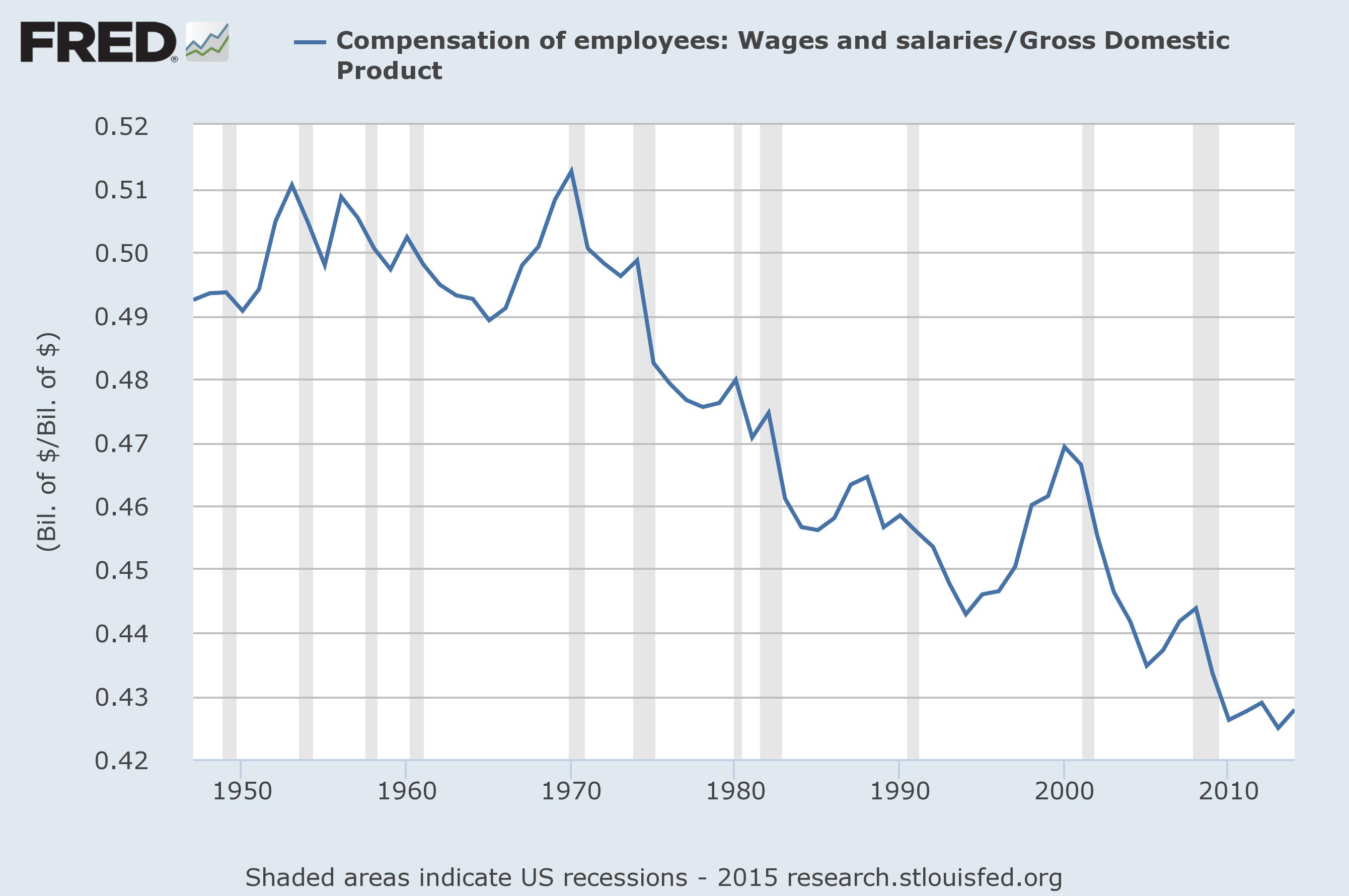
Wages as a share of GDP. Data from the St Louis Federal Reserve.
This is a chart of the total amount paid out as wages as a share of Gross Domestic Product (GDP). From 1947 to 1973 it bounced around a little, but was always about 50%. That was the great social contract that powered the myth. Workers got half of the benefits of the system in the form of wages, investors got the other half.
Something changed, however, and the inflection point hits sharply in 1973. From that point on, save a brief correction in the 1990s, it’s straight downhill to a worker’s share of a bit under 43% today. The difference? If workers still took in half of all wages we’d all be taking home 16% more in pay ( (50-43) / 43 ). Remember that number.
We can look at wages per employee by dividing this wage figure by the total number of employees and adjusting for inflation. There’s a lot of math going into this chart to make the numbers work out in constant 2015 Dollars, but you can see what happened quickly:
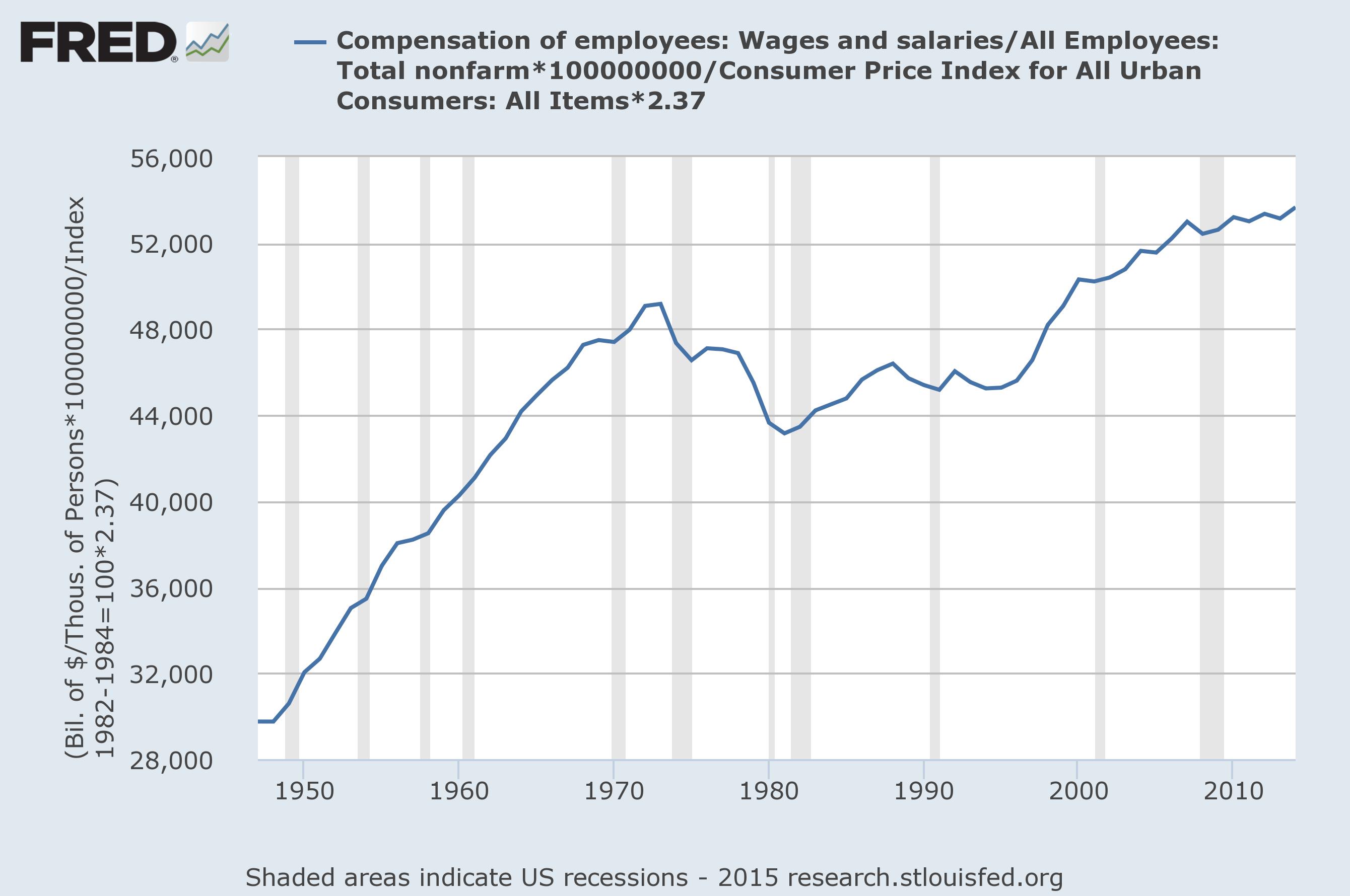
Average (median) pay per worker in constant 2015 Dollars. Data from the St Louis Federal Reserve.
Wages grew dramatically from 1947 until the same inflection point in 1973. From there, it dipped down until about 1983 when they stabilized, not reaching an upward bounce until the 1990s. You can see in this chart why Carter lost, but it’s not as though the Reagan years were a lot better.

There is work to be done.
In this chart, in terms of an average salary of a worker, the upward bounce continues until today. That’s because the total workers as a percent of the population peaked in 2000, meaning there are fewer people employed. As we’ve discussed before, there may not be enough paid work to go around in today’s economy. Too many workers puts downward pressure on wages by supply and demand. It’s worth reviewing on it’s own before we continue, so follow the link.
From 1950 to 1970 real, inflation adjusted wages went up nearly 50%, or $16k in 2015 dollars. If the bounce that started in 1995 had continued until today at the same rate the average pay would be at $62k, not the $53k they are today – a 16% rise. That is the difference between workers getting 50% of GDP and 42%, as shown in the first chart.
But there’s one last chart worth considering, the net productivity chart. That’s a simple matter of real GDP (inflation adjusted) divided by total employees – net output per worker. It’s been on a fairly constant rise for a while, but there was a bump:
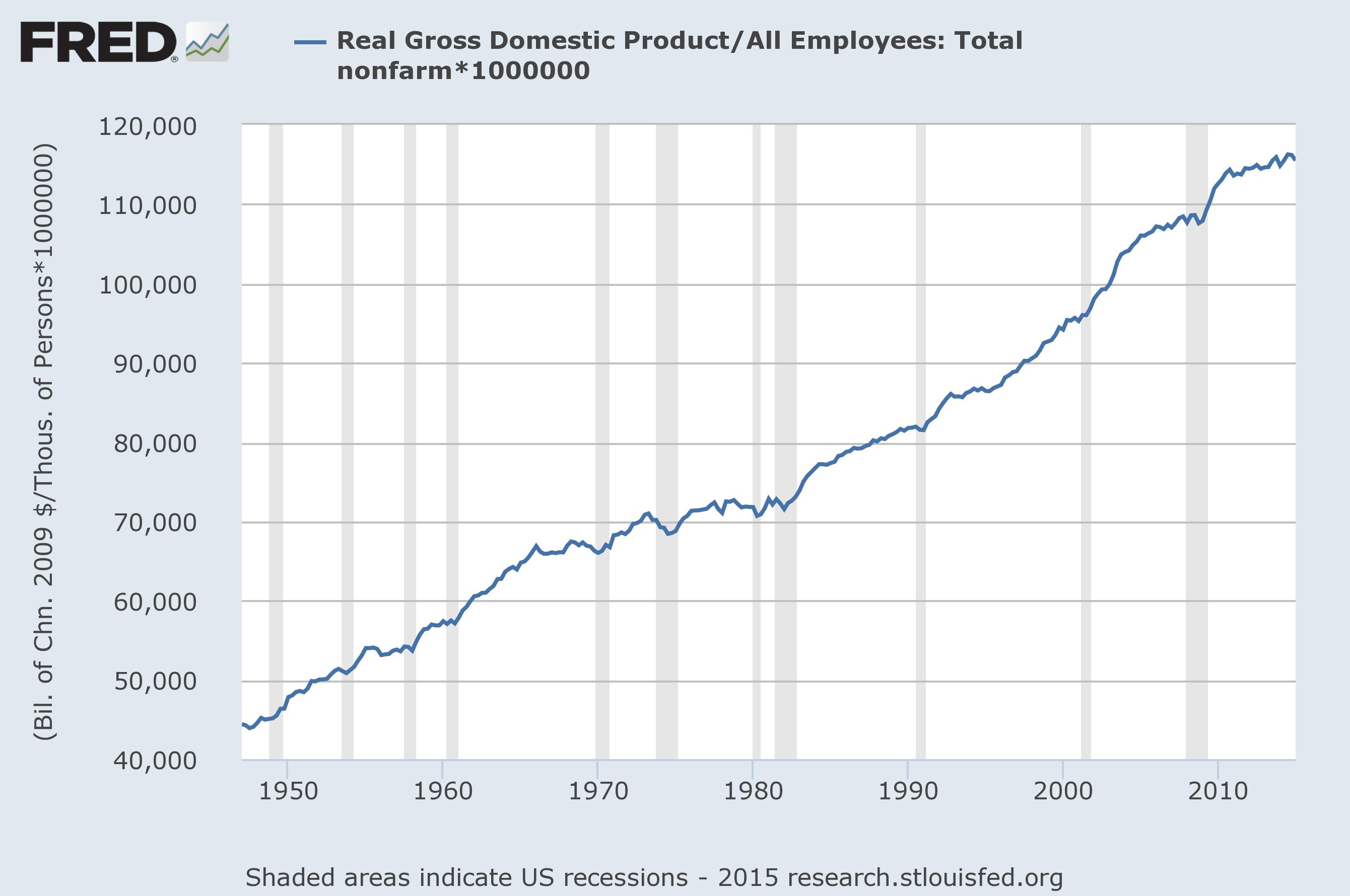
Productivity, defined as real (inflation adjusted) GDP per worker. Data from the St Louis Federal Reserve.
Yes, back to about 1973. It was fairly flat for a while, but productivity has been on a fairly constant upward trajectory since 1947, save a small pause in the 1960s and 1970s that was considerably flatter. Was that the fault of Carter? Or workers?

Sen Bernie Sanders (I-VT)
There’s no point in assigning blame before we all know the numbers, but one thing is clear: Sen Sanders has a point when he says the last 40 years have been a period of decline for working people. What’s interesting is that aside from a pause in the 1970s it hasn’t been a problem with worker output, so you can’t blame the workers for it.
What did change was the basic social contract that workers got, on average, half of all the gains. That stopped in what appears to be an ordinary downturn but never recovered. A real boom in the 1990s helped, and hard times in the 2000s weren’t that hard for people with jobs, but we have only slipped further behind.
Where did things go wrong? It appears that a business cycle that generated a slower rate of productivity starting in 1965 didn’t hit workers hard for about 8 years – but then really hit. Things picked up a bit in the bull market of the 80s, but for workers it still took about 8 years of lag before wages came back.
But from there it gets strange because when that upbeat business cycle ended in 2000 productivity kept rising. Workers who are still employed aren’t exactly taking the hit they did in previous cycles, but fewer people are employed.
What does this mean in the end? Ordinary business cycles explain a lot of what we’ve seen over the last 40 years, at least if you assume an 8 year lag between a change in a market and a change in worker’s wages. But the basic division of the spoils did indeed change 40 years ago and almost came back before 2000 before falling again.
Something has changed, and it’s worth focusing on why. Workers are getting a smaller share of the economy, possibly due to automation and the capital it takes to buy machines dominating the economy today.
Want to blame a president for this? That sounds hard. It seems more like something we have to work on together and not accept easy, pay answers like “It’s all Reagan/Bush’s fault!”
