
How will we know when the economy is turning the corner towards real growth? Everyone has their own answer, but Fed Chair Janet Yellen told us last March what she has on her “dashboard”. As the most powerful person in the financial world, and probably the whole world, her opinion counts more than most. With the arrival of another piece of data on where we stand right now in the second quarter of 2014 (2Q14), it’s time to check in on how we’re all doin’.
What we see is that we’re making some substantial progress, but we still have an awfully long way to go before we can say we’re close to the last time everyone felt remotely flush, which is before the arrival of what Barataria calls a “Managed Depression” at the end of year 2000.
Let’s start by running down the components individually, because a quick look at the charts shows the obvious way to quantify the gauges on the dashboard into one handy measurement of progress.
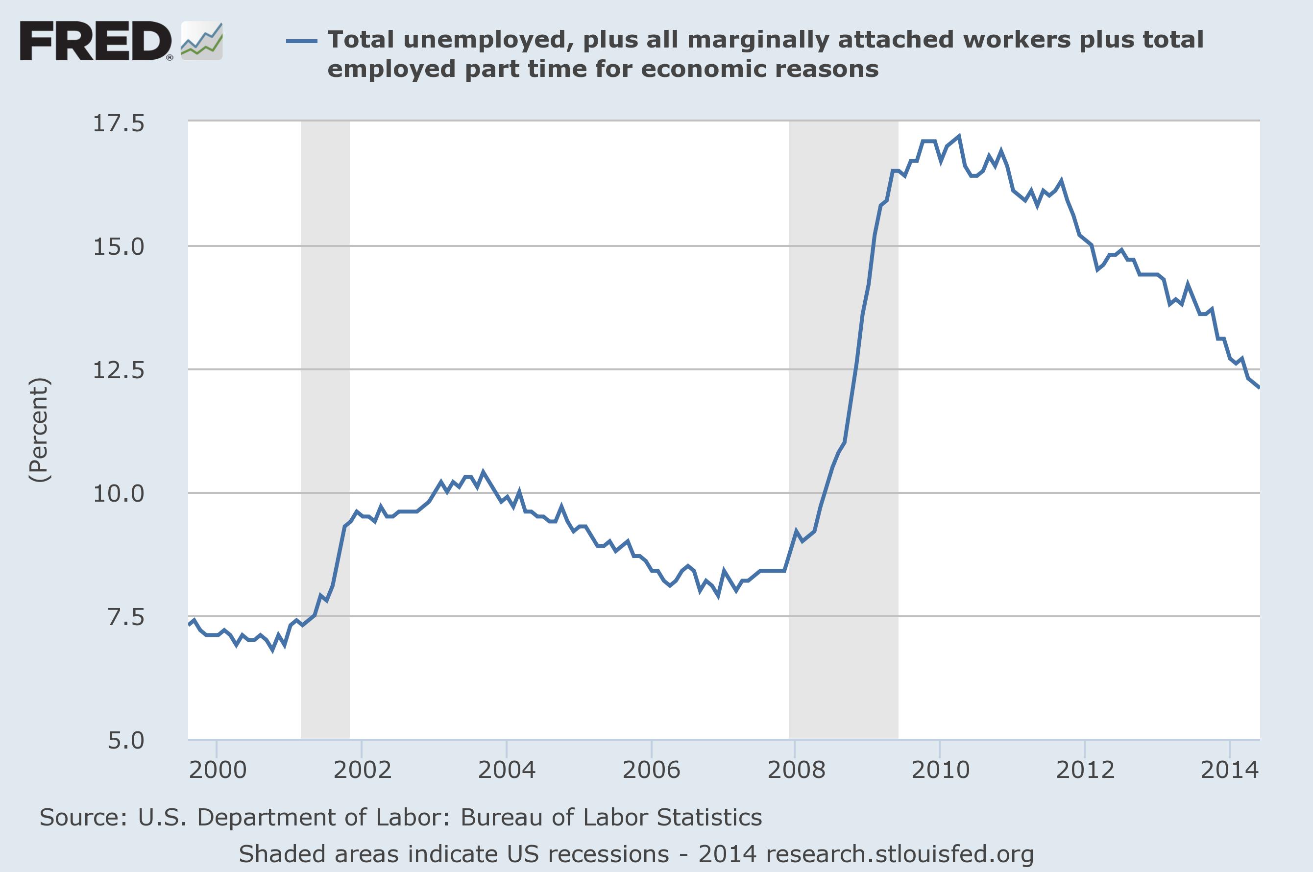
U6 Unemployment – this is the broadest measure of unemployment which includes workers without jobs, those who might work if they could find it (perhaps in school instead) and those with part-time work who want more hours. In 2000 it was at 7.1% of the population but peaked at 17.2% in 2010. Today, it’s at 12.1%
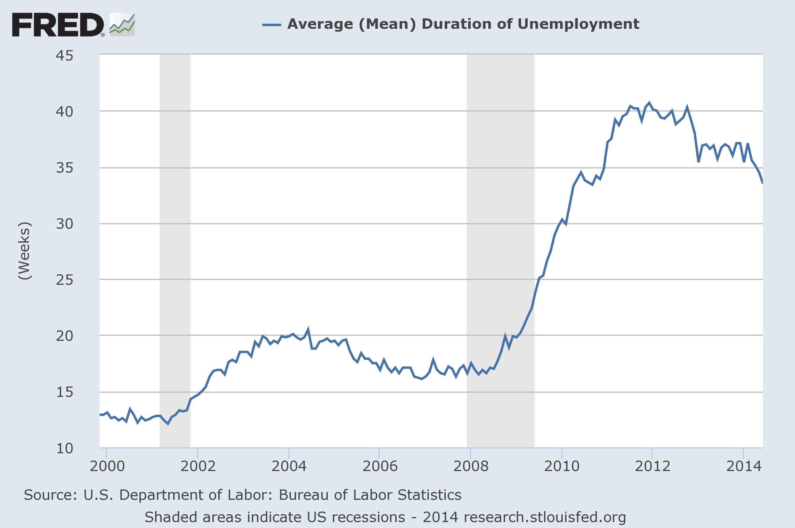
Long Term Unemployment – The average duration of unemployment was at 12.4 weeks in 2000, where it had been for many years. It spiked up to 40.7 weeks by 2011 and has stayed terribly high. It’s back down to 33.5 weeks today.
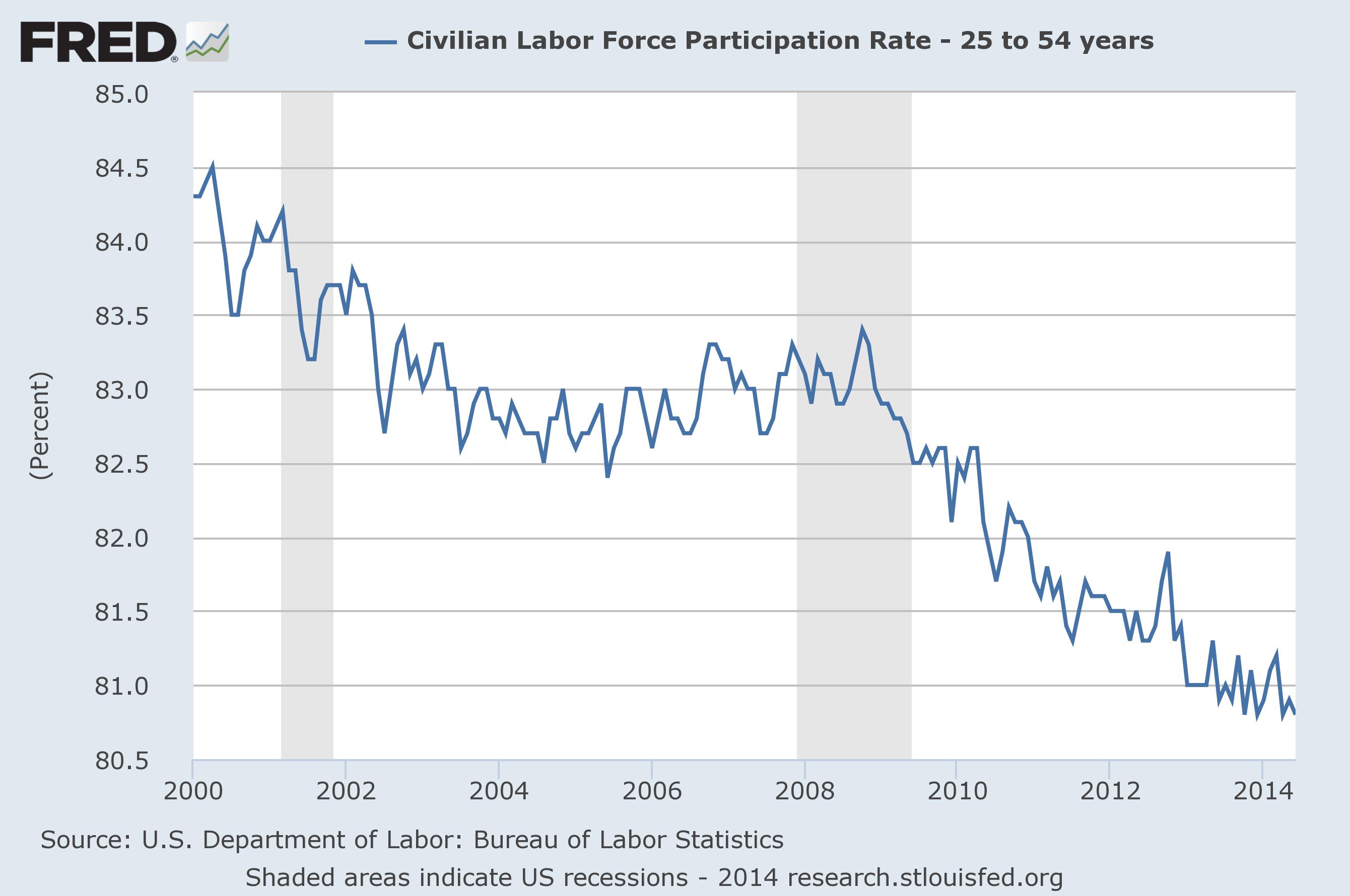
Workforce Participation – This is a tricky one, because it’s hard to tell just what is relevant. Indeed, Yellen herself qualified the problem, given that the overall Civilian Labor Force Participation Rate is falling at least in part because Baby Boomers are retiring as we’ve discussed before. So here is the participation rate among only 25-54 year olds, which is to say people who are in prime working years. It was at 84.1% in 2000 and dropped to 80.8% in 2012, where it is today.
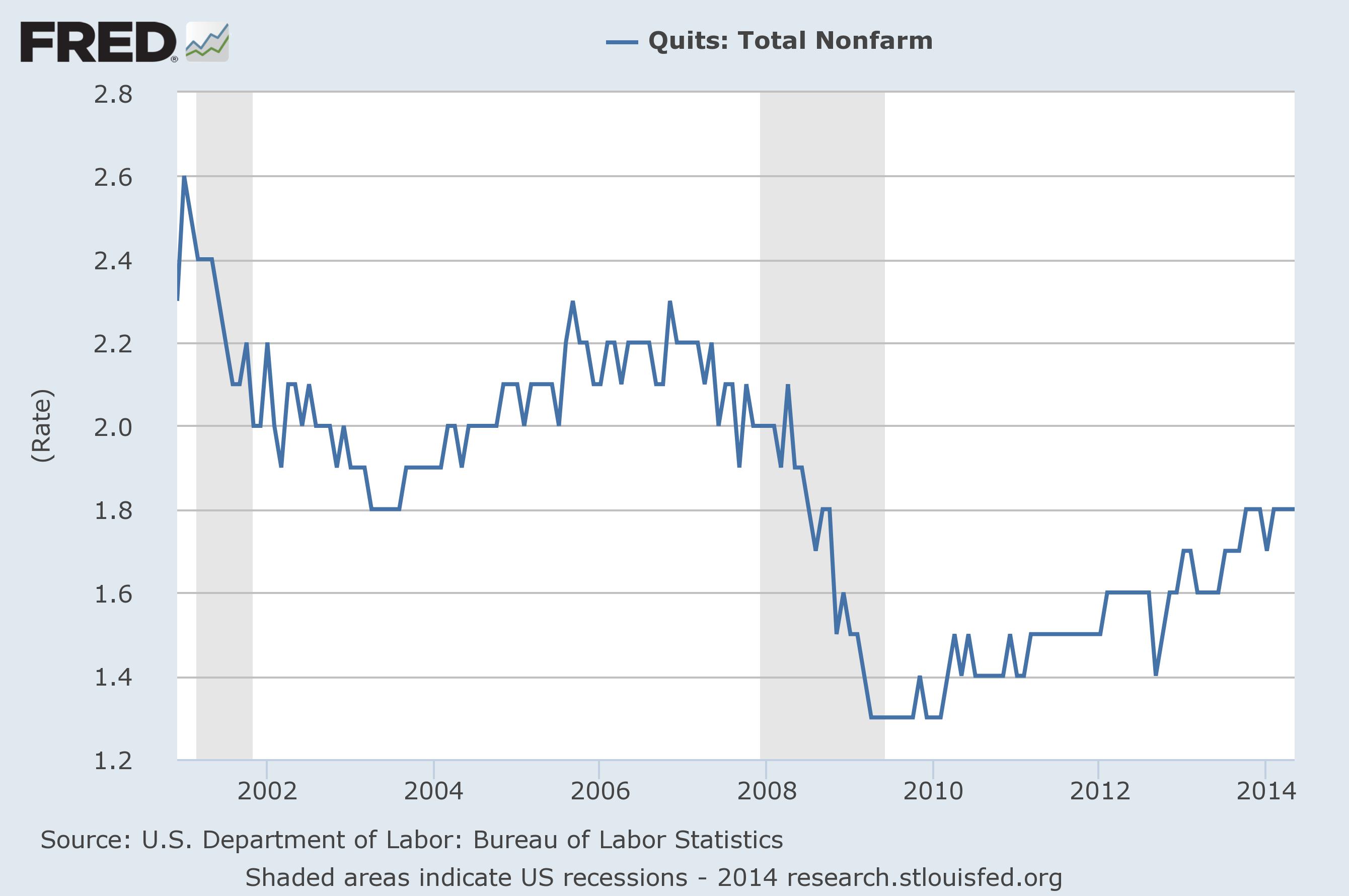
Quits Rate – This is also a bit mysterious, a data point buried in the Job Openings and Labor Turnover (JOLT) report which just came out for June. It’s the percent of workers who voluntarily quit their job, meaning they had a better offer somewhere else. It was at 2.4% every month in 2000, but fell to 1.3% in 2009. It’s back up to 1.8% today.
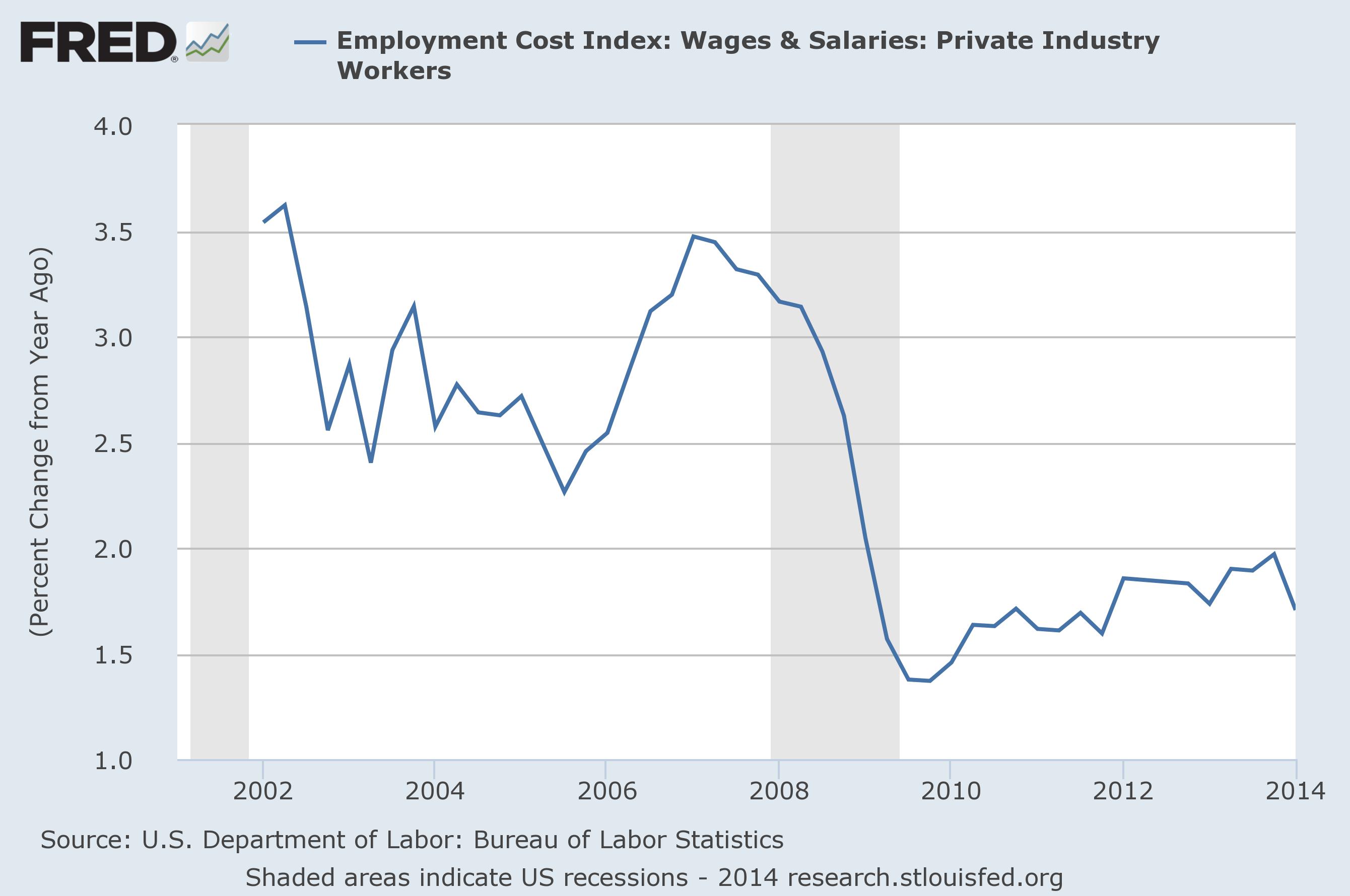
Wage Growth – This is the rate of change of salaries, an inflation figure. We don’t have data as far back as 2000, but we can guess that it was around 3.5%, a rate it was at a few years later. That fell to 1.4% in 2009, and has only clawed back to 2.0% today.
Taking all of this together, we can assemble a chart using year 2000 as the standard of a strong economy and look at the low point for each of these figures as the total range from goodness to badness. Where we are now is somewhere in the middle. Note that the first two are gauges that we want to be low, the last three we want to be high.
| 2000 | Worst | 2Q13 | 1Q14 | 2Q14 | |
| U6 Unemployment | 7.1 | 17.2 | 14.2 | 12.7 | 12.2 |
| Long Term Unemployment | 12.4 | 40.7 | 35.7 | 35.6 | 33.5 |
| Workforce Participation | 84.1 | 80.8 | 80.8 | 81.2 | 80.8 |
| Quit Rate | 2.4 | 1.3 | 1.6 | 1.8 | 1.8 |
| Wage Growth | 3.5 | 1.4 | 1.9 | 1.7 | 2.0 |
Normalizing each data point to a max of 20 allows us to add up the 5 to a total of 100 points, where 0 is the bottom and 100 is economic nirvana as defined by 2000. Where are we today?
| 2Q13 | 1Q14 | 2Q14 | |
| U6 Unemployment | 5.9 | 8.9 | 9.9 |
| Long Term Unemployment | 3.5 | 3.6 | 5.1 |
| Workforce Participation | 0.0 | 2.4 | 0.0 |
| Quit Rate | 5.5 | 9.1 | 9.1 |
| Wage Growth | 4.8 | 2.9 | 5.7 |
| Total | 19.7 | 26.9 | 29.8 |
The short answer is that while we’ve made progress in the last year and even the last quarter, we aren’t even halfway back to where we were in 2000. Granted, these are items that Yellen picked because they are the most troublesome, persistent indicators that point to not just pain but lingering, chronic pain. Progress is good, but we can’t say we have a healthy economy until these hit at least 50 and growing.
When will that occur? I’m going to go out on a limb again and say that the Yellen Dashboard is not going to cross 50 until 2016 at the earliest, and won’t show substantial change until the predicted year everything changes of 2017. But progress is good all the same. Stay tuned!

Keith Richards will be 100 by the time the world economy and U.S recovers from the great recession.
Judging by the looks of him, that’s coming up pretty soon! 🙂
Please stop any further mileage that you want to get out of the term managed depression and your 2017 prediction.
You have already gotten 200,000 miles out of those!
It is like going to church. We have heard that sermon already!
Well, of these two things you’re tired of, I can say two different things.
On the Managed Depression, these charts show once again what I’ve been saying all along – that the downturn started in 2001, had a small to nil recovery 2004-2007, and then turned down again before a stronger recovery 2012-today. It’s very obvious that this is one long event, and by the length alone you have to call it a “Depression”. Don’t like the handle “Managed”? Coin your own!
On the Year Everything Changes, if you don’t believe me then just wait and see. If you’d like to place a bet, I’m always game. But it’s also very clear based on the progress that we’ve made that we need another 8-10 quarters at this rate to say things have turned around, and I’m willing to say that we’ll have a bit of a pause before we get there. That puts us squarely into 2017. We are still very much on track to hit it spot on, one year after my prediction. Don’t like it? Don’t read Barataria.
The glass isn’t even close to half full so this is an easy call. If this is progress I’d hate to see what stagnation is. Being off the worst recession in decades isn’t much to be happy about.
No, it’ isn’t half full yet. But these are the worst of the lingering signs of badness, so if anything this is a pessimist’s gauge. And even this is improving (if slowly).
I am confused by wage inflation as a part of this. Isn’t it relative to the overall CPI? I know that inflation was much higher back in 2000 so maybe 3.5% isn’t a good number after all.
The length of unemployment is also weird because don’t people lose benefits after some time, or were they extended indefinately? It’s been years now for a lot of people.
An excellent point. Yellen didn’t specify anything like that, although we know that the Fed in general is looking for more inflation than we have. So for her purposes, I think it’s good as devised – but for our purposes it should be the above chart divided by CPI. Let me work on that.
If it’s not unreasonable, I’d like to see your dashboard number in a chart over time. The low point isn’t the same for all of these and it’s not clear how far we have come since whenever the total low came.
I will work on that and get back to you. No promises as to when. 🙂
Pingback: A Jolt of Confidence | Barataria - The work of Erik Hare
Pingback: Labor in a (Jackson) Hole | Barataria - The work of Erik Hare
Pingback: Job Loss Hits a Milestone | Barataria - The work of Erik Hare
Pingback: Pop! | Barataria - The work of Erik Hare
Pingback: Yellen’s Dashboard – Update | Barataria - The work of Erik Hare
Pingback: 2014, ex Machina | Barataria - The work of Erik Hare
Pingback: Audit the Fed? | Barataria - The work of Erik Hare
Pingback: Fed Raising Rates …. When? | Barataria - The work of Erik Hare
Pingback: A Glance at the Dashboard | Barataria - The work of Erik Hare