
There are many ways to measure an economy, as we’ve discussed before. There are thousands of workers toiling away at the Bureau of Labor Statistics (BLS), Bureau of Economic Analysis (BEA) and many other agencies providing more data than anyone will ever be able to fully understand. It’s something like the internet in terms of data overload, except many of these measures were developed before the information age. It used to be fun to get the reports in big thick binders of paper that professionals at least pretended to read.
We have this all real-time now, and there is a lot of it. One of the most comprehensive employment reports that comes out monthly is the rarely lauded Job Openings and Labor Turnover Survey (JOLTS) from the BLS. It’s worth getting to know if you really want the details on the state of employment today.

Did you get our jobs?
Many individual pieces of data make up JOLTS, so the report is inherently far more interesting than most of the monthly releases. One of the really obscure ones, the rate at which people are quitting their jobs (the “quits” rate), made it onto Fed Chair Janet Yellen’s Dashboard in her testimony before Congress. But that’s far from the most interesting thing contained in the report.
In June, there were 4.8 million jobs filled by enthusiastic new employees. The total number of listings is about 4.7 million, meaning it takes an average of a month to fill a job. This is probably the most important number that comes exclusively from JOLTS, and it’s one of the most positive signs that the economy is indeed turning over:
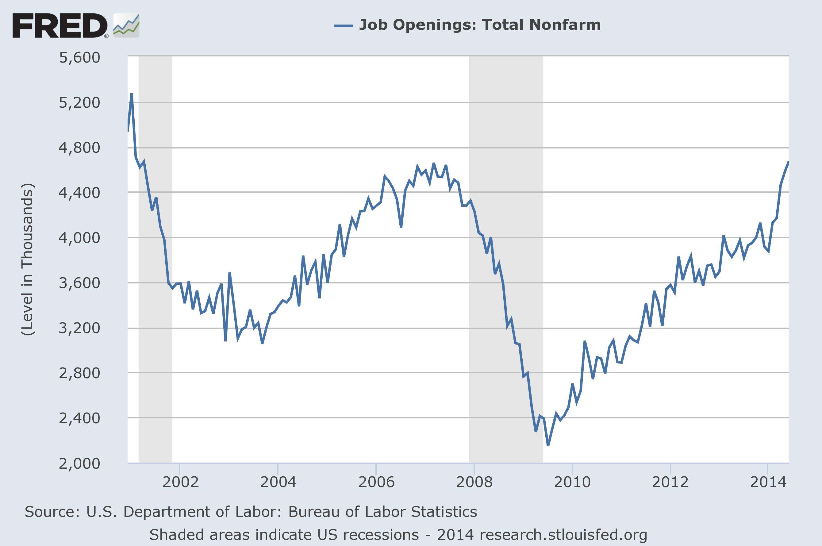
Note that we’re back up to where we were in 2006 in terms of jobs each month, although a bit shy of the 5.2M pace set before this depression started in 2000. However, since we only recently reached that point, we can’t say for sure that it won’t grow much higher or indeed that this isn’t a sign of “churn” as people switch from one job to another.
That 4.7M jobs is 3.4% of the total 140M jobs, meaning that the average term of employment is about 2.5 years. We have such a dynamic economy that it is possible to totally re-invent it four times a decade, if necessary, assuming workers have the necessary skills to adjust.

Big companies have been slow to hire, slow to increase hours
It’s also important to note that with a net gain of about 220k jobs every month the figures that everyone watches closely for signs that the unemployed are finding work are very small. The net gain is only 4.7% of the total number of jobs filled each month and less than 0.2% of the total number of jobs. This is why the survey method of calculating job gains used by the BLS is statistically silly – you take two very big numbers, the total number of jobs each month, subtract them, and find a difference so small that no survey can every claim to show them with precision.
The “quits” rate, or rate at which people voluntarily leave their jobs, is at 1.8% of total employment. It’s very small.
JOLTS also has a lot of data on where the job openings are for anyone who is looking for work. The biggest industries? Trade and Transportation, a big category, and Health care both have over 700k openings waiting to be filled. Arts and entertainment is the smallest at only 76k.
What can we learn from the JOLTS survey? More about employment in the US today than you probably ever wanted to. The key figures are always the hires rate, which look about as good as anything we’ve seen since the collapse of Lehman Brothers. But everyone has their own part of it that might seem intriguing, from Chair Yellen to the person looking for a gig in entertainment.
Of all the pieces of information that are released by all the various government agencies, JOLTS is one of the most comprehensive. And since a lot of policy is determined by the state of employment today, it’s worth keeping an eye on.

Rest in peace Lauren Bacall and Humphrey Bogart.
Didn’t Bogart die a long time ago?
Yes, in 1957!
That chart is interesting – it goes WAY up in 2014. That is a lot of jobs every month, but if the gain is still small you have to wonder.
There is a lot of “churn” going on, where people are leaving jobs for better ones. It is something that has to happen as the economy changes and people see opportunity. It really points to an overall improvement even more than the number of actual jobs gained each month, which has gone up to around 220k.
Pingback: One Last Bubble? | Barataria - The work of Erik Hare
Good blog. Best when you explain things. Love the chart, it does show that things are better. Thanks!
Thanks!
Pingback: Skills Gap? | Barataria - The work of Erik Hare
Pingback: Job Loss Hits a Milestone | Barataria - The work of Erik Hare
Pingback: Contracted Change | Barataria - The work of Erik Hare
Pingback: Not Hiring, but not Firing | Barataria - The work of Erik Hare